What Are the Different Components?
Getting to Know the Components
What Are the Different Components?
Getting to Know the Components


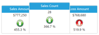
 Major Indicator: Displays up to six measures in a cover flow style. It will also display time-based comparisons as a
percentage change and can be used as a dashboard selector.
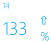
Measure Box: Displays a single measure with options to display as a time-based comparison. Can be used as a
dashboard selector.
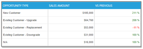
Table: Displays up to four measures and selected Display By values. This component is used mainly for
comparison purposes. This component can be a dashboard selector.
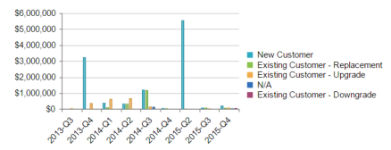
Chart: Displays up to four measures in one chart. All four measures can be displayed in 21 different charting
formats found in the Data Option window. This component can also be a dashboard selector.
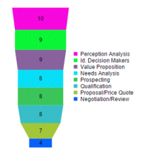
Funnel: Displays two measures a funnel shaped chart. The primary measure is used to shape the formula
and the second measure displays as a number only. This component can be a dashboard selector.
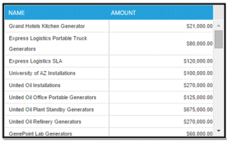
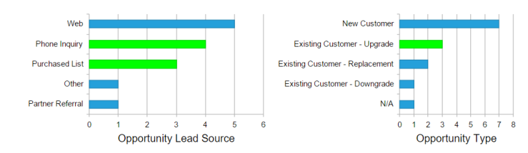
List: Displays summarized data in rows and provides default column sorting, grouping and filtering functions.
This component can be a dashboard selector.
Summary: Displays the summary total of a List component. It displays a total count and the option to display a
numerical column for that total. This component can be a dashboard selector.
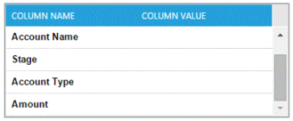
Detail Box: Displays the detail columns for a single row of List data. This enables you to reduce the number of
columns displayed in List components and view the detailed data as needed. You can customize the data you want
to see displayed under the Data Option window.
Multiple Chart: Displays a single measure with four possible Group By options. The purpose of the Multiple Chart is to
provide drill down capabilities and multiple selections across different charts. When this component is turned on as a
dashboard selector, the drill down feature is enabled.
Text Box: Displays static text that can be customized to your preference. Will also display dynamic data, such as
time period or data from interaction with other components.
Hyperlink: Displays text as a hyperlink that connects one dashboard to another or link to a URL in or outside of
Salesforce.com. It has two levels of passing parameters between dashboards, meaning it can pass filters from a
component on one dashboard to apply to the hyperlinked dashboard. This facilitates drill down capabilities
between dashboards. See ‘Setting Up A Hyperlink’ for more details.
Image: Allows you to insert images saved in your Salesforce org to customize your dashboards.
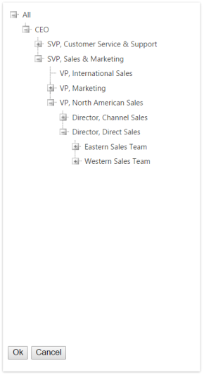
Organization Selector: Enables you to filter the data displayed on your dashboard to display within a certain role or user
in the organization. It includes a list of all the organization roles and users whose data you already have access to view.
Major Indicator: Displays up to six measures in a cover flow style. It will also display time-based comparisons as a
percentage change and can be used as a dashboard selector.
Measure Box: Displays a single measure with options to display as a time-based comparison. Can be used as a
dashboard selector.
Table: Displays up to four measures and selected Display By values. This component is used mainly for
comparison purposes. This component can be a dashboard selector.
Chart: Displays up to four measures in one chart. All four measures can be displayed in 21 different charting
formats found in the Data Option window. This component can also be a dashboard selector.
Funnel: Displays two measures a funnel shaped chart. The primary measure is used to shape the formula
and the second measure displays as a number only. This component can be a dashboard selector.
List: Displays summarized data in rows and provides default column sorting, grouping and filtering functions.
This component can be a dashboard selector.
Summary: Displays the summary total of a List component. It displays a total count and the option to display a
numerical column for that total. This component can be a dashboard selector.
Detail Box: Displays the detail columns for a single row of List data. This enables you to reduce the number of
columns displayed in List components and view the detailed data as needed. You can customize the data you want
to see displayed under the Data Option window.
Multiple Chart: Displays a single measure with four possible Group By options. The purpose of the Multiple Chart is to
provide drill down capabilities and multiple selections across different charts. When this component is turned on as a
dashboard selector, the drill down feature is enabled.
Text Box: Displays static text that can be customized to your preference. Will also display dynamic data, such as
time period or data from interaction with other components.
Hyperlink: Displays text as a hyperlink that connects one dashboard to another or link to a URL in or outside of
Salesforce.com. It has two levels of passing parameters between dashboards, meaning it can pass filters from a
component on one dashboard to apply to the hyperlinked dashboard. This facilitates drill down capabilities
between dashboards. See ‘Setting Up A Hyperlink’ for more details.
Image: Allows you to insert images saved in your Salesforce org to customize your dashboards.
Organization Selector: Enables you to filter the data displayed on your dashboard to display within a certain role or user
in the organization. It includes a list of all the organization roles and users whose data you already have access to view.


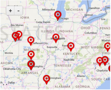
 Map: Displays data on a map. The source data could be a mapped measure with a Display By option which displays data
on a summary level within the map. The source data could also be detail records from a mapped List component. This
component provides an option for easy visualization and single or multiple selection when interacting with other
components. This component can be a dashboard selector.
Map: Displays data on a map. The source data could be a mapped measure with a Display By option which displays data
on a summary level within the map. The source data could also be detail records from a mapped List component. This
component provides an option for easy visualization and single or multiple selection when interacting with other
components. This component can be a dashboard selector.
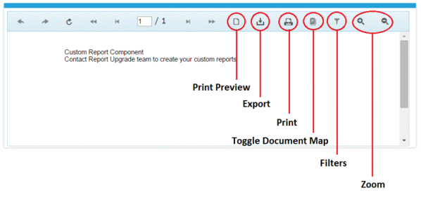
 Custom Report: A Custom Report pulls any data from your dashboard to create a custom formatted report to
display data any way you want it, in a printable format. The report must be pre-built by the Report Upgrade
Service Team. Once built, you can select the custom formatted report from within the component Edit Options.
Can interact with certain components, but it is not able to be a dashboard selector.
Custom Report: A Custom Report pulls any data from your dashboard to create a custom formatted report to
display data any way you want it, in a printable format. The report must be pre-built by the Report Upgrade
Service Team. Once built, you can select the custom formatted report from within the component Edit Options.
Can interact with certain components, but it is not able to be a dashboard selector.


 Time Selector: Displays time period options which, when selected, will refresh the data displayed on your
dashboard specific to the selected time period.
Time Selector: Displays time period options which, when selected, will refresh the data displayed on your
dashboard specific to the selected time period.