List
 Time Period Option
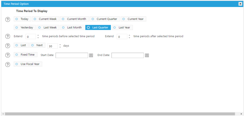
 1.
Displays your data in the dashboard by the selected date
2.
Extends the time period selected above, before or after by a specified number of time periods. Make sure to uncheck the
Compared To selection below in order to do so.
3.
Select Daily Level if the trending data will show as daily. Choose Selected Period Level if the trending should match to the selected
time period level. For example, when Current Month is selected as time period the trending will be at monthly level.
4.
Displays your data in the dashboard by a specific number of past or future days.
5.
Displays your data using the Fiscal year as your selected time period.
Data Option
1
2
3
4
5
1.
Displays your data in the dashboard by the selected date
2.
Extends the time period selected above, before or after by a specified number of time periods. Make sure to uncheck the
Compared To selection below in order to do so.
3.
Select Daily Level if the trending data will show as daily. Choose Selected Period Level if the trending should match to the selected
time period level. For example, when Current Month is selected as time period the trending will be at monthly level.
4.
Displays your data in the dashboard by a specific number of past or future days.
5.
Displays your data using the Fiscal year as your selected time period.
Data Option
1
2
3
4
5


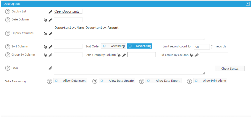
 1.
The list will be displayed in the component.
2.
The date field associated with the selected list. This is used for conditioning purpose.
3.
Choose the fields you want to display in column form.
4.
Choose how you want the above fields to be sorted, the order you want them sorted in, and the number of records to be displayed.
5.
Choose how you want to group the list.
6.
Custom filter option to further filter the measures selected above. Use the Check Syntax box before clicking OK to ensure the filter
will be applied effectively.
7.
Live-edit function allows for the insert of data records. Insert Columns must be selected for this list to allow insert of data. Go to
Setup, then List Mapping to select Insert Columns for this list.
8.
Allows updates to an existing record within the object. Update Columns must be selected for this list to allow for data updates. Go
to Setup, then List Mapping to select Update Columns for this list.
9.
Select this box to allow data from this list to be exported.
10.
Select this box to allow data from this list to be printed separately.
1
2
3
4
5
1.
The list will be displayed in the component.
2.
The date field associated with the selected list. This is used for conditioning purpose.
3.
Choose the fields you want to display in column form.
4.
Choose how you want the above fields to be sorted, the order you want them sorted in, and the number of records to be displayed.
5.
Choose how you want to group the list.
6.
Custom filter option to further filter the measures selected above. Use the Check Syntax box before clicking OK to ensure the filter
will be applied effectively.
7.
Live-edit function allows for the insert of data records. Insert Columns must be selected for this list to allow insert of data. Go to
Setup, then List Mapping to select Insert Columns for this list.
8.
Allows updates to an existing record within the object. Update Columns must be selected for this list to allow for data updates. Go
to Setup, then List Mapping to select Update Columns for this list.
9.
Select this box to allow data from this list to be exported.
10.
Select this box to allow data from this list to be printed separately.
1
2
3
4
5


 6
7
6
7
 8
9
8
9
 10
Interaction Option
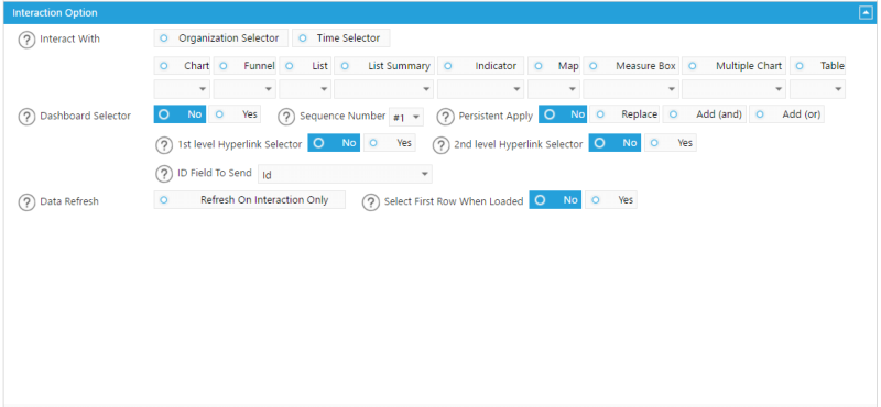
1.
Preset the other components with which you want this component’s data to react to when they are selected. Under each
component option you can choose ALL or a Sequence number (#1) which can be assigned to each component so that this data
only reacts when a certain numbered component is selected.
2.
Select Yes to make this component a dashboard selector so that other preset components will refresh when it is selected. Select
No if you do not want any other data to react to this selection.
3.
You can assign different sequence numbers to multiple of the same type of component to differentiate them.
4.
Choose whether you want the selection of this component to continue to filter data even when another component on the
dashboard is selected. Or choose to Replace the data in this component when another component is selected. Or choose to Add
(and) or Add (or) to combine the filter with the filter of another component.
5.
In order to pass a filter through to another or multiple dashboards you must select one of the Hyperlink Selectors. The level is not
important, only that the selection on the receiving end matches your selection here: Level 1 to Level 1 and Level 2 to Level 2.
6.
In order to pass a filter through to another or multiple dashboards you must select one of the Hyperlink Selectors. The level is not
important, only that the selection on the receiving end matches your selection here: Level 1 to Level 1 and Level 2 to Level 2.
7.
Choose the column to be sent out as a filter to any components that react to the list.
8.
If you want the component to wait to load any data until you have made a selection from another component, select the Refresh
On Interaction Only box.
9.
If Yes is selected, the first row of your data will be selected upon loading of your dashboard and will apply a filter automatically to
any components that react to this component.
1
10
Interaction Option
1.
Preset the other components with which you want this component’s data to react to when they are selected. Under each
component option you can choose ALL or a Sequence number (#1) which can be assigned to each component so that this data
only reacts when a certain numbered component is selected.
2.
Select Yes to make this component a dashboard selector so that other preset components will refresh when it is selected. Select
No if you do not want any other data to react to this selection.
3.
You can assign different sequence numbers to multiple of the same type of component to differentiate them.
4.
Choose whether you want the selection of this component to continue to filter data even when another component on the
dashboard is selected. Or choose to Replace the data in this component when another component is selected. Or choose to Add
(and) or Add (or) to combine the filter with the filter of another component.
5.
In order to pass a filter through to another or multiple dashboards you must select one of the Hyperlink Selectors. The level is not
important, only that the selection on the receiving end matches your selection here: Level 1 to Level 1 and Level 2 to Level 2.
6.
In order to pass a filter through to another or multiple dashboards you must select one of the Hyperlink Selectors. The level is not
important, only that the selection on the receiving end matches your selection here: Level 1 to Level 1 and Level 2 to Level 2.
7.
Choose the column to be sent out as a filter to any components that react to the list.
8.
If you want the component to wait to load any data until you have made a selection from another component, select the Refresh
On Interaction Only box.
9.
If Yes is selected, the first row of your data will be selected upon loading of your dashboard and will apply a filter automatically to
any components that react to this component.
1
 2
5
2
5
 7
7
 3
3
 4
4
 6
6
 9
9
 8
8
 Display Option
1
Display Option
1
 2
2
 3
3
 4
4
 5
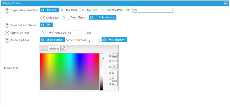
1.
Select a data level within your organization to limit data access for this component. Or select the green button to select a specific
role within your organization.
2.
Displays and sums up all of the users directly below the above selected level or role by the Direct Report. Or you can display and
sum up all of the users in all the levels below the selected data level by choosing the Subordinate box.
3.
Choose whether or not to show a column header.
4.
Choose to display the list with a scroll bar, or by page with a set number of rows on each page.
5.
Add some emphasis to your component by choosing the Show Border and/or With Shadow boxes and choose a custom color and
size for your border.
5
1.
Select a data level within your organization to limit data access for this component. Or select the green button to select a specific
role within your organization.
2.
Displays and sums up all of the users directly below the above selected level or role by the Direct Report. Or you can display and
sum up all of the users in all the levels below the selected data level by choosing the Subordinate box.
3.
Choose whether or not to show a column header.
4.
Choose to display the list with a scroll bar, or by page with a set number of rows on each page.
5.
Add some emphasis to your component by choosing the Show Border and/or With Shadow boxes and choose a custom color and
size for your border.
Time Period Option
1.
Displays your data in the dashboard by the selected date
2.
Extends the time period selected above, before or after by a specified number of time periods. Make sure to uncheck the
Compared To selection below in order to do so.
3.
Select Daily Level if the trending data will show as daily. Choose Selected Period Level if the trending should match to the selected
time period level. For example, when Current Month is selected as time period the trending will be at monthly level.
4.
Displays your data in the dashboard by a specific number of past or future days.
5.
Displays your data using the Fiscal year as your selected time period.
Data Option
1
2
3
4
5
1.
The list will be displayed in the component.
2.
The date field associated with the selected list. This is used for conditioning purpose.
3.
Choose the fields you want to display in column form.
4.
Choose how you want the above fields to be sorted, the order you want them sorted in, and the number of records to be displayed.
5.
Choose how you want to group the list.
6.
Custom filter option to further filter the measures selected above. Use the Check Syntax box before clicking OK to ensure the filter
will be applied effectively.
7.
Live-edit function allows for the insert of data records. Insert Columns must be selected for this list to allow insert of data. Go to
Setup, then List Mapping to select Insert Columns for this list.
8.
Allows updates to an existing record within the object. Update Columns must be selected for this list to allow for data updates. Go
to Setup, then List Mapping to select Update Columns for this list.
9.
Select this box to allow data from this list to be exported.
10.
Select this box to allow data from this list to be printed separately.
1
2
3
4
5
6
7
8
9
10
Interaction Option
1.
Preset the other components with which you want this component’s data to react to when they are selected. Under each
component option you can choose ALL or a Sequence number (#1) which can be assigned to each component so that this data
only reacts when a certain numbered component is selected.
2.
Select Yes to make this component a dashboard selector so that other preset components will refresh when it is selected. Select
No if you do not want any other data to react to this selection.
3.
You can assign different sequence numbers to multiple of the same type of component to differentiate them.
4.
Choose whether you want the selection of this component to continue to filter data even when another component on the
dashboard is selected. Or choose to Replace the data in this component when another component is selected. Or choose to Add
(and) or Add (or) to combine the filter with the filter of another component.
5.
In order to pass a filter through to another or multiple dashboards you must select one of the Hyperlink Selectors. The level is not
important, only that the selection on the receiving end matches your selection here: Level 1 to Level 1 and Level 2 to Level 2.
6.
In order to pass a filter through to another or multiple dashboards you must select one of the Hyperlink Selectors. The level is not
important, only that the selection on the receiving end matches your selection here: Level 1 to Level 1 and Level 2 to Level 2.
7.
Choose the column to be sent out as a filter to any components that react to the list.
8.
If you want the component to wait to load any data until you have made a selection from another component, select the Refresh
On Interaction Only box.
9.
If Yes is selected, the first row of your data will be selected upon loading of your dashboard and will apply a filter automatically to
any components that react to this component.
1
2
5
7
3
4
6
9
8
Display Option
1
2
3
4
5
1.
Select a data level within your organization to limit data access for this component. Or select the green button to select a specific
role within your organization.
2.
Displays and sums up all of the users directly below the above selected level or role by the Direct Report. Or you can display and
sum up all of the users in all the levels below the selected data level by choosing the Subordinate box.
3.
Choose whether or not to show a column header.
4.
Choose to display the list with a scroll bar, or by page with a set number of rows on each page.
5.
Add some emphasis to your component by choosing the Show Border and/or With Shadow boxes and choose a custom color and
size for your border.
