|
<< Click to Display Table of Contents >> Chart |
  
|
|
<< Click to Display Table of Contents >> Chart |
|
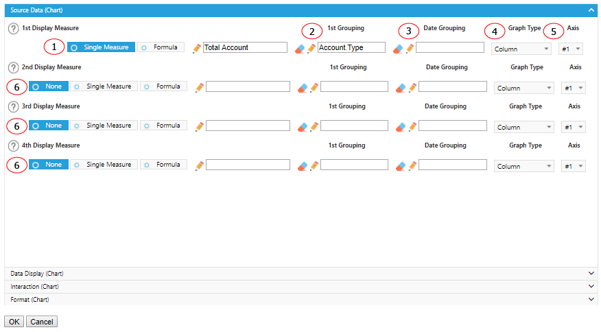
Once a component is created and selected, click on the Options button on the top bar to modify the data it displays and customize it to your preferences.

Options - Source Data
Options - Data Display
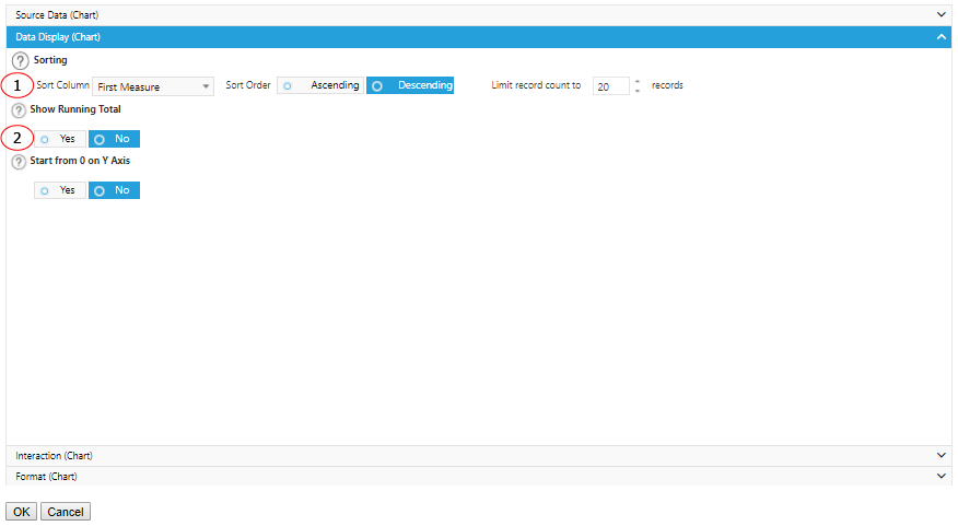
1. Sort how you would like the column to be displayed by choosing from the drop-down menu. Also, choose what order you want your data to be displayed and how many records you want to pull data from.
2. Display data by running total which aggregates data from the beginning of the time period to the displayed time period. Each time period is displayed as a total including all time periods before.
Options - Interaction
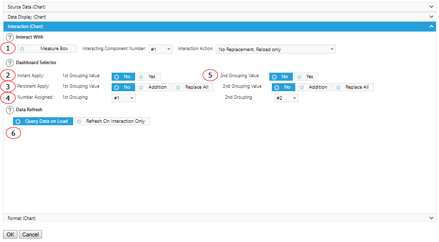
1. Interact with MeasureBox to receive metadata. Specify the component number and action to perform after received the metadata.
2. Select Yes to make this component a dashboard selector so that other preset components will refresh when it is selected. Select No if you do not want any other data to react to this selection.
3. Select Yes to keep the selection of this component continues to apply in the interactions from other components. You could replace an existing list of value for persistent apply or add on to it.
4. Assign different sequence numbers to differentiate interaction components.
5. Interaction setting for 2nd grouping of the component.
6. If you want the component to wait to load any data until you have made a selection from another component, select the Refresh On Interaction Only box.
Options - Format
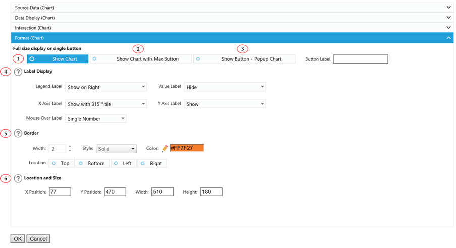
1. Display the Chart as a normal chart.
2. Display the Chart as a normal chart with a max button to max out the Chart size.
3. Instead of displaying the Chart, it displays a clickable button. You can customize the label for the button and the Chart will show up as a popup window when a user clicks on the button.
4. Choose how you would like the labels for your chart displayed by choosing from the drop down bars for each part of the chart.
5. Add some emphasis to your component by choosing the Show Border and/or With Shadow boxes and choose a custom color and size for your border.
6. The displaying location and size of the component.