|
<< Click to Display Table of Contents >> Map |
  
|
|
<< Click to Display Table of Contents >> Map |
|
Once a component is created and selected, click on the Options button on the top bar to modify the data it displays and customize it to your preferences.

Options - Source Data
Map component is the only component which can use summary level data and detail (record level) data as the data source. Select Option 1 - Summary to treat it like measure based components like Table or Chart. Select Option 2 - Detail Data to treat it like row-based components like List or List Detail.
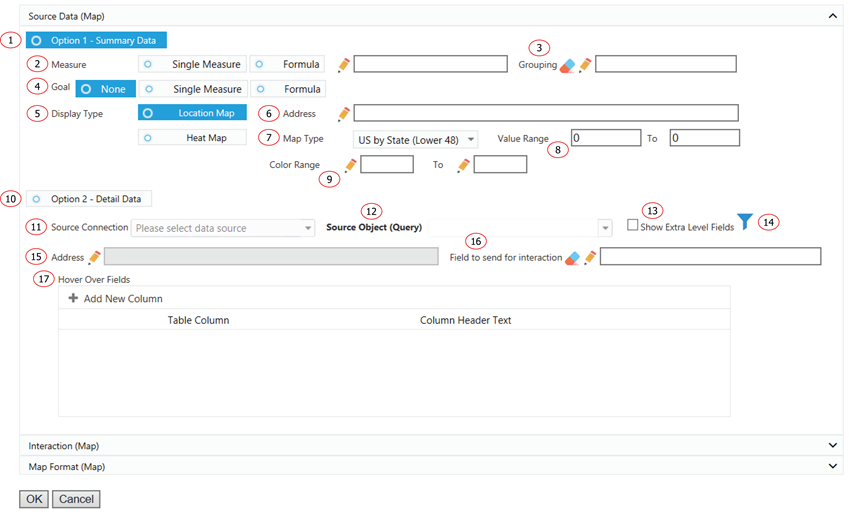
1. Use measure and grouping to display data.
2. The measure will be displayed in the component.
3. Choose how you want to group the measure.
4. Choose a goal to compare to your main measure.
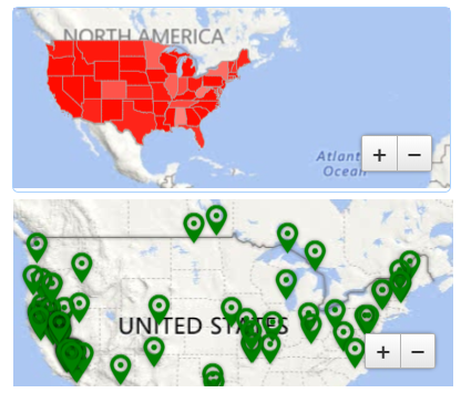
5. Map component could be displayed as location map or as a heat map. Select Location Map to display location by address. Select Heat Map to display the main measure on a selected map type.
6. Choose the address field for locations on the map.
7. Select a Map Type to show the map area for your data.
8. The main measure value range. This is used to decide the color displaying on the map.
9. The color range is used to display the color based on the value range. For example, the value range is 1 to 10. The color range is white to red. When measure value is 1, it will be displayed as white. When measure value is 5, it will be displayed between the color of white and red. Value 10 will be displayed as red.
10. Use row-level data for the data source.
11. The data source of the component.
12. The source object or query of the component.
13. In normal Salesforce field selection, Report Upgrade displays selected object fields together with all the direct parent object fields. The object hierarchy is child-parent. This function display one more level of parent objects for field selection. The hierarchy is child-parent-parent. It allows field selection to extend to grandparents’ level.
14. Click on Filter icon to add a filter(s) to the component.
15. Choose the address field for locations on the map.
16. Choose the field value to send when the component is used as dashboard selector.
17. Add a list of fields to be displayed when mouse over a displayed location.
Options - Interaction
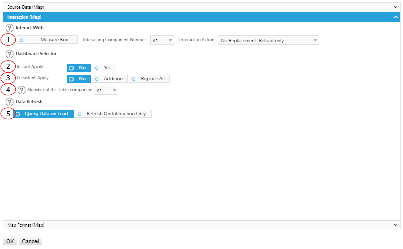
1. Interact with MeasureBox to receive metadata. Specify the component number and action to perform after received the metadata.
2. Select Yes to make this component a dashboard selector so that other preset components will refresh when it is selected. Select No if you do not want any other data to react to this selection.
3. Select Yes to keep the selection of this component continues to apply in the interactions from other components. You could replace an existing list of value for persistent apply or add on to it.
4. Assign different sequence numbers to differentiate interaction components.
5. If you want the component to wait to load any data until you have made a selection from another component, select the Refresh On Interaction Only box.
Options - Map Format
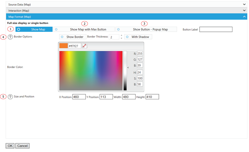
1. Display the Chart as a normal chart.
2. Display the Chart as a normal chart with a max button to max out the Chart size.
3. Instead of displaying the Chart, it displays a clickable button. You can customize the label for the button. The Chart will show up as a popup window when a user clicks on the button.
4. Add some emphasis to your component by choosing the Show Border and/or With Shadow boxes and choose a custom color and size for your border.
5. The displaying location and size of the component.