|
<< Click to Display Table of Contents >> Measure Box |
  
|
|
<< Click to Display Table of Contents >> Measure Box |
|
Once a component is created and selected, click on the Options button on the top bar to modify the data it displays and customize it to your preferences.

Each component will have different customization options in the Options window:
Options - Source Data
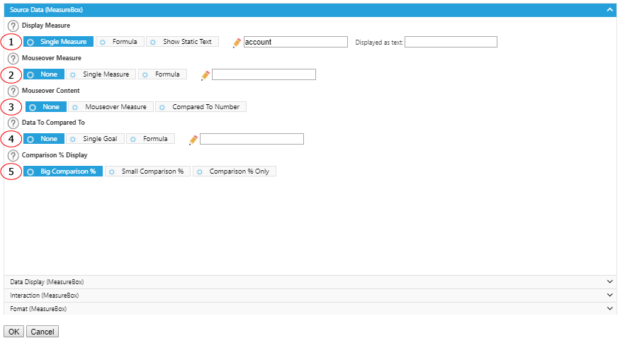
1. The measure will be displayed in the component.
2. The additional measure that will be displayed in a pop-up bubble when your mouse rests on the component.
3. Choose Mouseover Measure to display with the selected measure. Or choose Compared To Number to display the time period compared to the selected mouseover measure.
4. The additional measure to compare to the main measure selected on the 1st item.
5. Display the component with more focus on comparison percentage (Big Comparison %), more focus on the main measure (Small Comparison %), or display only the comparison % without the main measure.
Options - Data Display
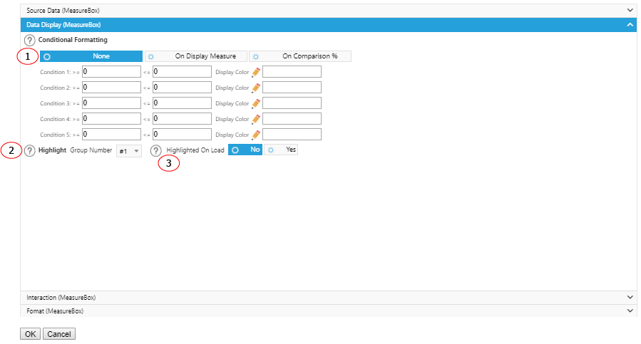
1. If you want to add color to one of the displayed measures choose which measure to color. Then choose the range Conditions and the custom color you want to assign to that range of measures.
2. You can highlight a Measure component when it is in a group of multiple Measure components on your dashboard by specifying the group number. You can also choose to highlight that component upon loading the dashboard by selecting Yes.
3. Highlight this MeasureBox component when the dashboard is loaded.
Options - Interaction
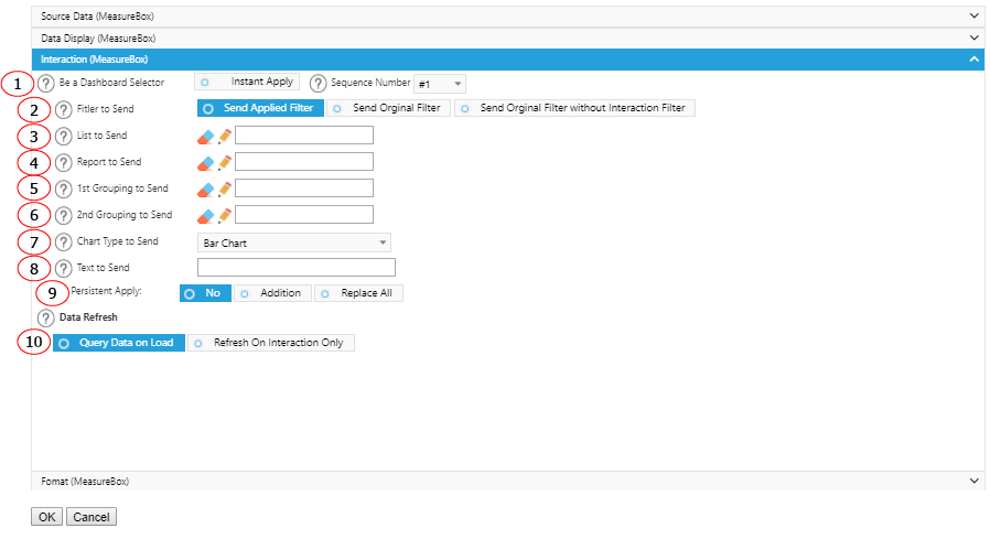
1. Select Instant Apply to make this component a dashboard selector so that other preset components will refresh when it is selected. Select a number to represent this component.
2. When sending information like measure out to other components, the filter(s) to be sent is the original filter(s) defined in the component or is the filter(s) applied interaction values already. For example, an interaction value Web from Lead Source has been applied to this component. When Send Applied Filter is selected, value Web will be sent as part of the package. When Send Original Filter is selected, value Web will not be sent.
3. List to send to List, Map or List Detail component for interaction purpose.
4. Report sent to Report component for interaction purpose.
5. 1st grouping to send to other components for interaction purpose.
6. 2nd grouping to send to other components for interaction purpose.
7. Chart Type to send to other components for interaction purpose.
8. Text to send to other components for interaction purpose.
9. Choose whether you want the text sent on above item (8) to continue to filter data even when another component on the dashboard is selected. Or choose to Replace the data in this component when another component is selected. Or choose to Addition to combine the filter with the filter of another component.
10. If you want the component to wait to load any data until you have made a selection from another component, select the Refresh On Interaction Only box. If you want to display a static text, select Static Text.
Options - Format
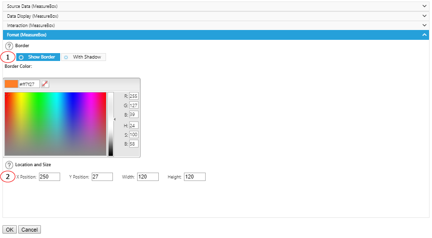
1. Add some emphasis to your component by choosing the Show Border and/or With Shadow boxes and choose a custom color and size for your border.
2. The displaying location and size of the component.