|
<< Click to Display Table of Contents >> Date Selector |
  
|
|
<< Click to Display Table of Contents >> Date Selector |
|
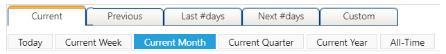
Once a component is created and selected, click on the Options button on the top bar to modify the data it displays and customize it to your preferences.

Options
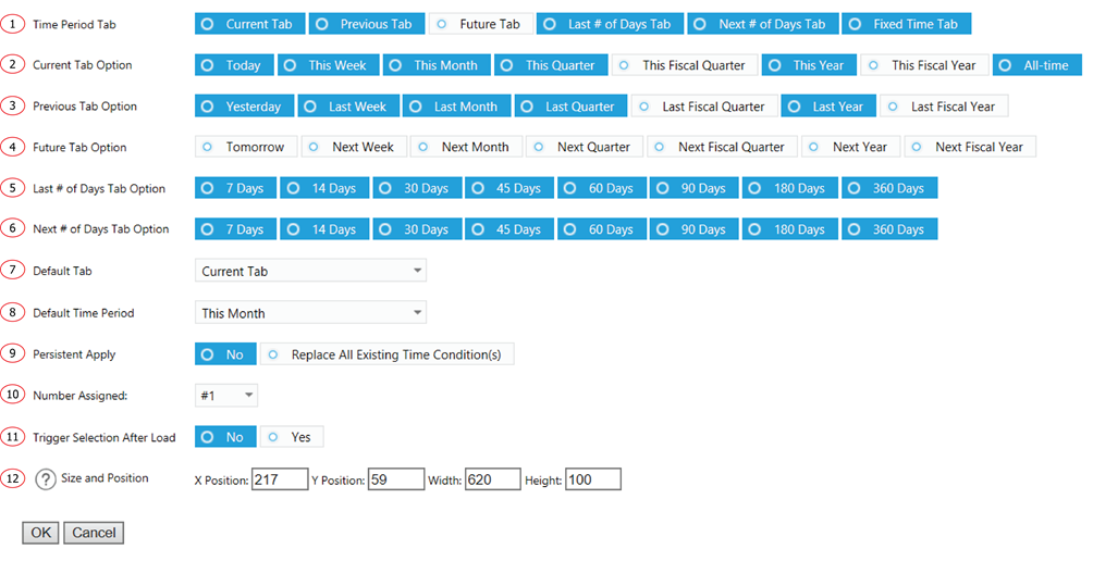
1. Select which tab to display as a selection option.
2. Select time period to display as a selection option within Current Time Period group.
3. Select time period to display as a selection option within Previous Time Period group.
4. Select time period to display as a selection option within Future Time Period group.
5. Select time period to display as a selection option within Last # of Days group.
6. Select time period to display as a selection option within Next # of Days group.
7. Default tab to show as selected when loaded.
8. Default time period to show as selected when loaded.
9. Select Replace All Existing Time to keep the selection of this component continues to apply in the interactions from other components. You could replace an existing list of value for persistent apply or add on to it.
10. Assign different sequence numbers to differentiate interaction components.
11. Automatically select the default value after the initial load. This is used to apply a default date range to other components when loaded.
12. The displaying location and size of the component.