|
<< Click to Display Table of Contents >> List |
  
|
|
<< Click to Display Table of Contents >> List |
|
Once a component is created and selected, click on the Options button on the top bar to modify the data it displays and customize it to your preferences.

Options - Source Data
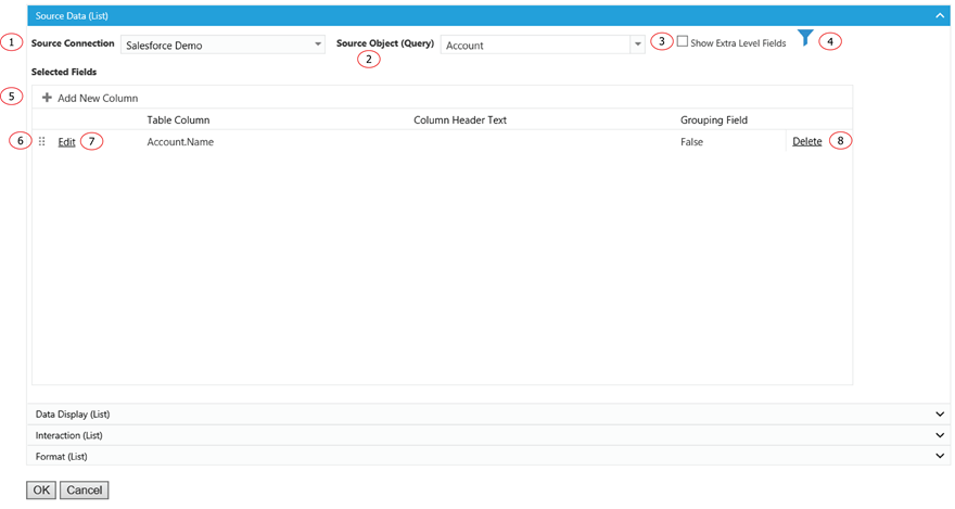
1. The data source of the component.
2. The source object or query of the component.
3. In normal Salesforce field selection, Report Upgrade displays selected object fields together with all the direct parent object fields. The object hierarchy is child-parent. This function display one more level of parent objects for field selection. The hierarchy is child-parent-parent. It allows field selection to extend to grandparents’ level.
4. Click on Filter icon to add a filter to the component.
5. Click on the plus icon to add a field to display in column form.
6. Grab the icon to drag and drop for reordering the columns.
7. Click on Edit to edit a selected column.
8. Click on Delete to remove a selected column.
Options - Data Display
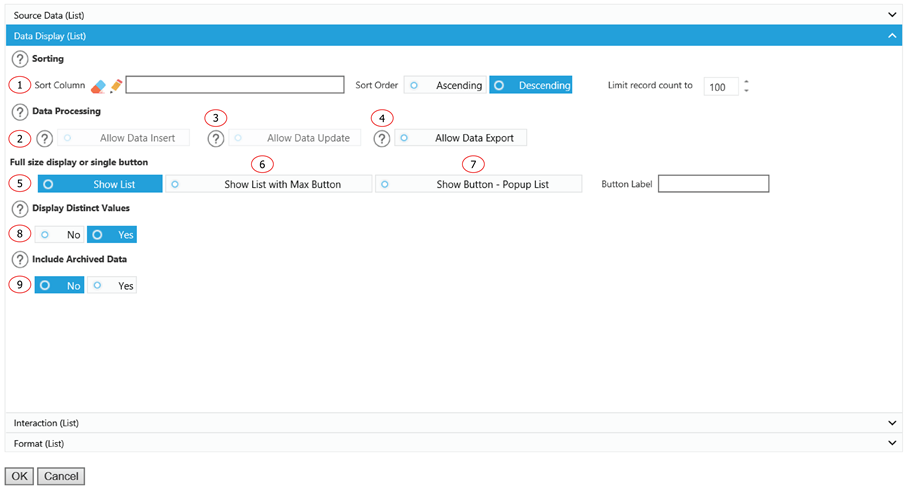
1. Choose how you want the fields to be sorted, the order you want them sorted in, and the number of records to be displayed. In a select non-distinct value situation, this option is served as both input and output condition for the number of records. In a select only distinct value situation, this option is only served as input condition to limit the number of rows queried in order to fetch the distinct list of values. The list of distinct values could be much less than the fetching record count.
2. Live-edit function allows for the insert of data records. Insert Columns must be selected for this list to allow insertion of data. Go to Setup, then List Mapping to select Insert Columns for this list. This function is currently disabled.
3. Allows updates to an existing record within the object. Update Columns must be selected for this list to allow for data updates. Go to Setup, then List Mapping to select Update Columns for this list. This function is currently disabled.
4. Select this box to allow data from this list to be exported.
5. Display the Chart as a normal chart.
6. Display the Chart as a normal chart with a max button to max out the Chart size.
7. Instead of displaying the Chart, it displays a clickable button. You can customize the label for the button and the Chart will show up as a popup window when a user clicks on the button.
8. If yes is selected, the list will display only distinct values.
9. If yes is selected, the list will include archived data.
Options - Interaction
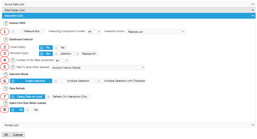
1. Interact with MeasureBox to receive metadata. Specify the component number and action to perform after received the metadata.
2. Select Yes to make this component a dashboard selector so that other preset components will refresh when it is selected. Select No if you do not want any other data to react to this selection.
3. Select Yes to keep the selection of this component continues to apply in the interactions from other components. You could replace an existing list of value for persistent apply or add on to it.
4. Assign different sequence numbers to differentiate interaction components.
5. Select a field to send out the value for interaction purpose.
6. Choose to select a single row at a time to filter your dashboard or multiple rows to filter your data using many records.
7. You want the component to wait to load any data until you have made a selection from another component, select the Refresh On Interaction Only box.
8. If Yes is selected, the first row of your data will be selected upon loading of your dashboard and will apply a filter automatically to any components that react to this component.
Options - Format
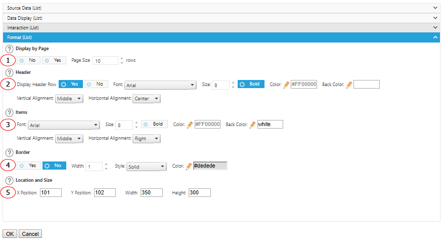
1. Choose to display the list with a scroll bar, or by page with a set number of rows on each page.
2. Choose whether or not to show a column header and the formatting options for the header.
3. Formatting options for items.
4. Add some emphasis to your component by choosing the Show Border and/or With Shadow boxes and choose a custom color and size for your border.
5. The displaying location and size of the component.