|
<< Click to Display Table of Contents >> List |
  
|
|
<< Click to Display Table of Contents >> List |
|
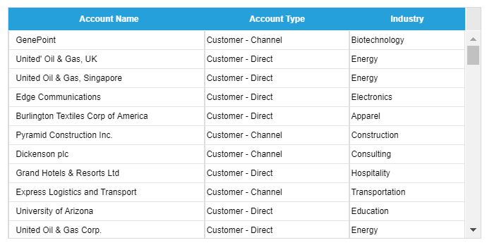
The List component displays detail data in rows and provides default column sorting, grouping, and filter functions. This component can also be used as a dashboard selector.
Options - Source Data
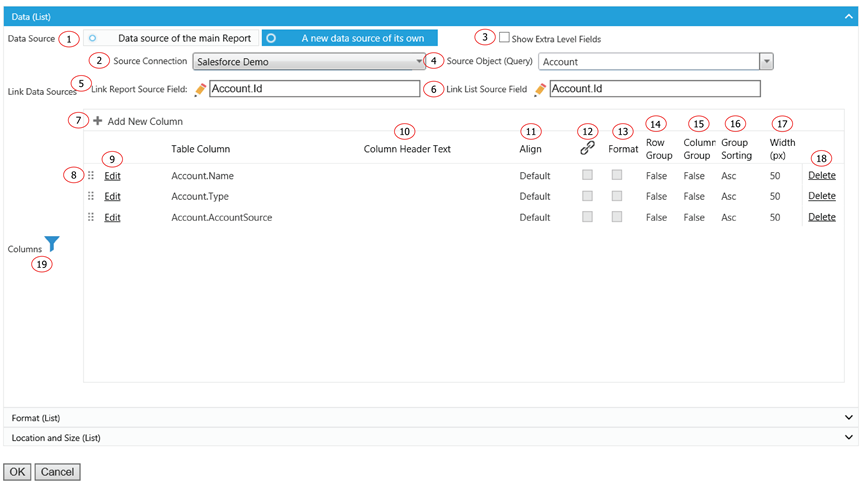
1. The data source of the table component. It could be the same as the report data source or separated data source(s).
2. The source connection of the data source in the situation when using a separated data source from the report data source.
3. In normal Salesforce field selection, Report Upgrade displays selected object fields together with all the direct parent object fields. The object hierarchy is child-parent. This function display one more level of parent objects for field selection. The hierarchy is child-parent-parent. It allows field selection to extend to grandparents’ level.
4. The source object or query of the component.
5. In the situation of using a different data source, which field from the report data source should be used to join to the data sources(s) from this component. This option is only available when using a different data source.
6. In the situation of using a different data source, which field from this component’s source should be used to join back to the data sources of the report. This option is only available when using a different data source.
7. Click on the plus icon to add a field to display in column form.
8. Grab the icon to drag and drop for reordering the columns.
9. Click on Edit to edit a selected column.
10. Replace the column header label with your own.
11. Assign content alignment for each field if different from Default.
12. Create a hyperlink on this field to allow a hyperlink to somewhere else. The hyperlink is constructed in a formula format. Its value could come from other field and not necessary the field show as a hyperlink.
13. Format the field to a certain format if not using default format. This is normally used for the formula field since it could be different type transformed from original field or fields.
14. Use this field as row group in the List.
15. Use this field as column group in the list.
16. Sort by ascending or descending order when using this field as a grouping.
17. The width of each field could be manually adjusted directly on the List component or type into the Width box here.
18. Click on Delete to remove a selected column.
19. Click on Filter icon to add a filter(s) to the component.
Options - Format
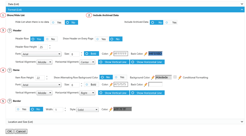
1. Choose to display the list with a scroll bar, or by page with a set number of rows on each page.
2. In Salesforce, event data were archived automatically after one year from activation date. By default, it will be not included in the query. If you need to include those archived event data, click yes to have it included.
3. Choose whether or not to show a column header and the formatting options for the header.
4. Formatting options for items.
5. Add some emphasis to your component by choosing the Show Border and/or With Shadow boxes and choose a custom color and size for your border.
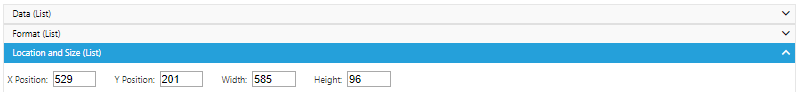
Options - Location and Size
The displaying location and size of the component.