|
<< Click to Display Table of Contents >> Available Components |
  
|
|
<< Click to Display Table of Contents >> Available Components |
|
What Are the Different Components?

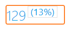
Measure Box: The Measure Box displays a single measure with the option to display it as a time-based comparison. It can also be used as a dashboard selector.
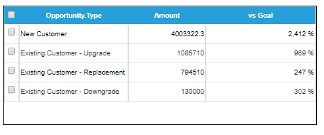
Table: The Table is capable of displaying up to four measures and their subsequent groups. This component is mainly used for comparison purposes but can also be a dashboard selector.
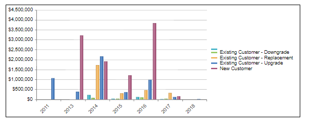
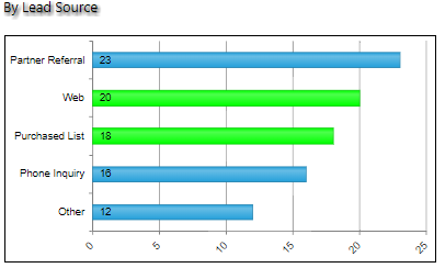
Chart: The Chart can display up to six measures at once while giving you the ability to select one measure. These six measures can be displayed in 21 different formats which can be changed in the Data Option window. This component can also be used as a dashboard selector.

Multiple Selection Chart: The Multiple Selection Chart displays a single measure with one single grouping option. The purpose of the Multiple Selection Chart is to provide the ability to select multiple values on a single chart.
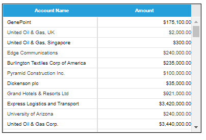
List: The List component displays detail data in rows and provides default column sorting, grouping, and filter functions. This component can also be used as a dashboard selector.
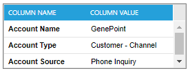
List Detail: The List Detail component displays the detail columns for a single row of List data. This enables you to reduce the number of columns displayed in List components and view the detailed data as needed.
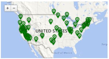
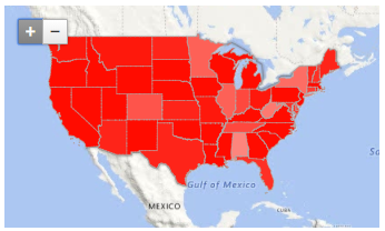
Map: The Map component displays data on a map or on a heat map. The source data could be summary level data from a grouped measure or detailed records from an object. This component provides an option for easy geo-visualization and single selection interaction with other components when used as a dashboard selector.
Text Box: The Text Box component displays static text that can be customized to your preference. It can also display dynamic data, such as time periods or data from an interaction with other components.

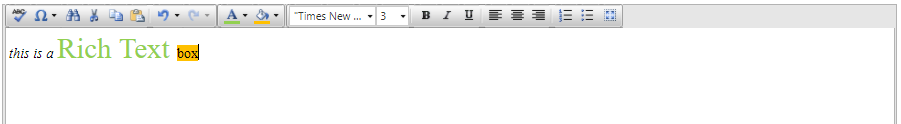
RichText Box: The RichText Box component provide more formatting capabilities on static text, like formatting a paragraph containing descriptions.
Hyperlink: The Hyperlink component displays text as a hyperlink that can connect one dashboard to another or link to a URL in or outside of Salesforce.com. It also has the ability to pass filters from the original dashboard which can be applied to the hyperlinked dashboard. This facilitates drill down capabilities between dashboards. See ‘Setting Up A Hyperlink’ for more details.
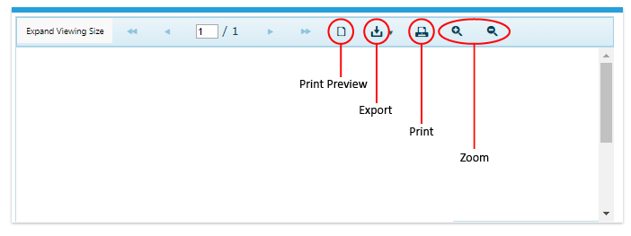
Report: The Report component is used to display reports created from the Report Builder or any existing custom reports. This component provides same viewer functions in the preview window of the Report Builder.
Image: The image component provides the ability to upload images that can be displayed on any dashboard.

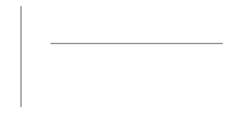
Line: The Line component displays a vertical or horizontal line on the dashboard.
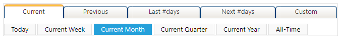
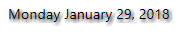
Date Selector: The Date Selector component displays time period options which, when selected, will refresh the data displayed on your dashboard to show data specific to the selected time period.